Web design styles: a visual guide with color palettes
Web design styles are recognizable visual languages - a set of decisions about grids, type, shapes and above all color. This guide walks through 19 styles, from historical movements like Bauhaus and Art Deco to modern trends like Glassmorphism and Bento Box, with a thumbnail, the typical color palette and the kind of project each one suits.
Preview your palette on these styles
How to read this guide
Each style below shows a screenshot of its template with a default palette, a one-line summary of its palette character, and a link to its own page with a live preview. Open any style to try your own colors inside it.
Historical design movements
Styles rooted in early and mid-20th-century art and design. They are built on strict geometry, flat color and confident typography, and they translate to the web very cleanly.
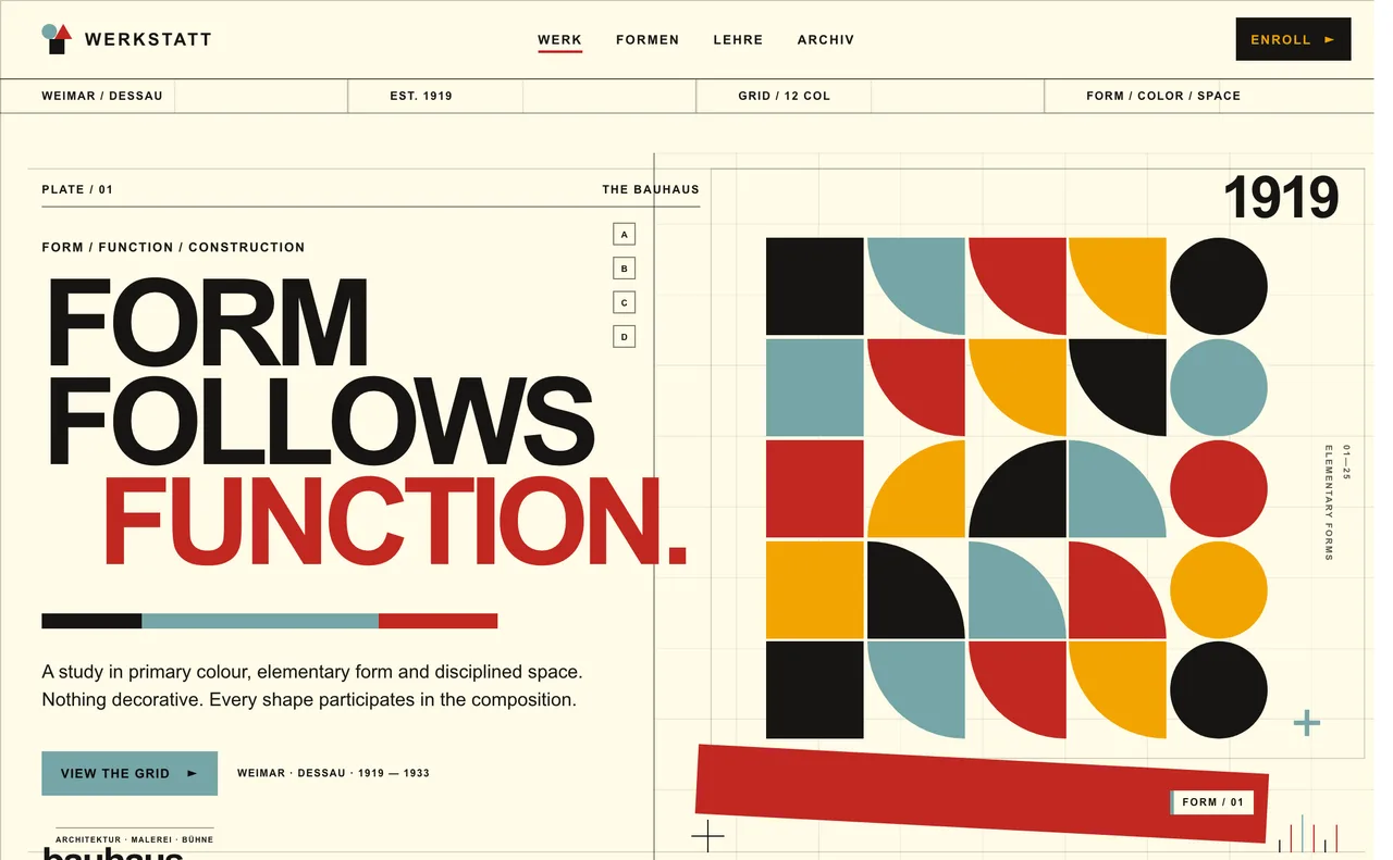
- Bauhaus - German design school, 1919-1933. An off-white or near-black base, flat fills and one confident primary, often blue or red. Suits design studios, education and brands that want clarity through geometry.
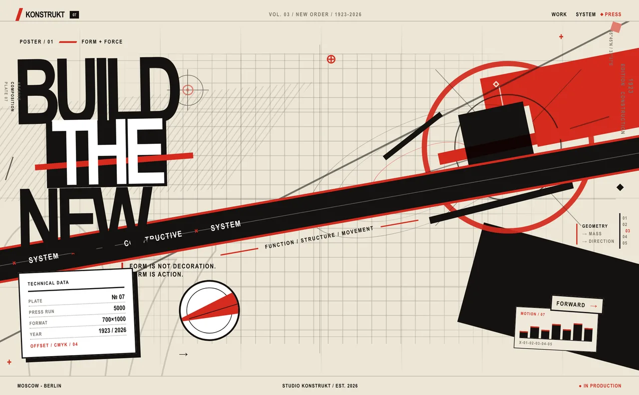
- Constructivism - Soviet avant-garde, 1919-1930s. A tight black, cream and red system with flat fills and diagonal color blocks. Suits campaigns, events and bold editorial statements.
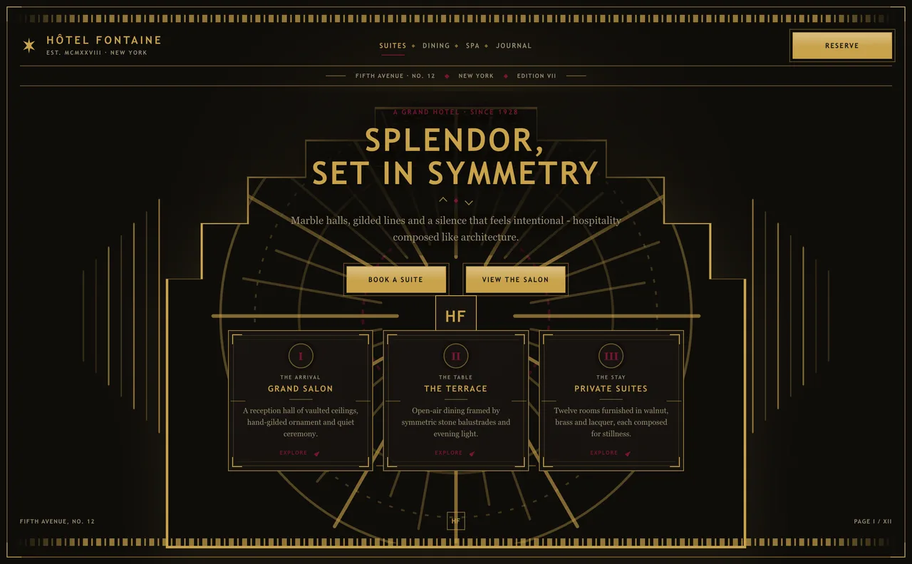
- Art Deco - 1920s-30s luxury. A near-black lacquer background, metallic gold linework and rare jewel-tone accents. Suits hospitality, premium products and formal launches.
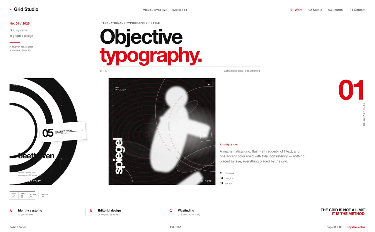
- Swiss Style - International Typographic Style, 1950s. Near-black on white, a strict column grid and one bold accent, classically red. Suits portfolios, agencies and information-heavy sites.
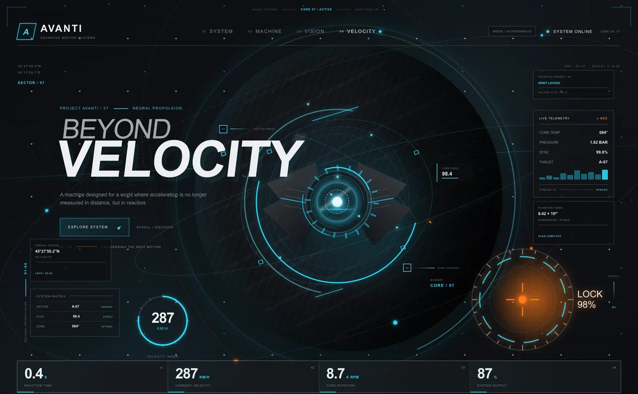
- Futurism - Sci-fi machine and HUD interfaces. A graphite-black base with reactor-orange glow and cyan telemetry. Suits hardware, mobility and performance products.
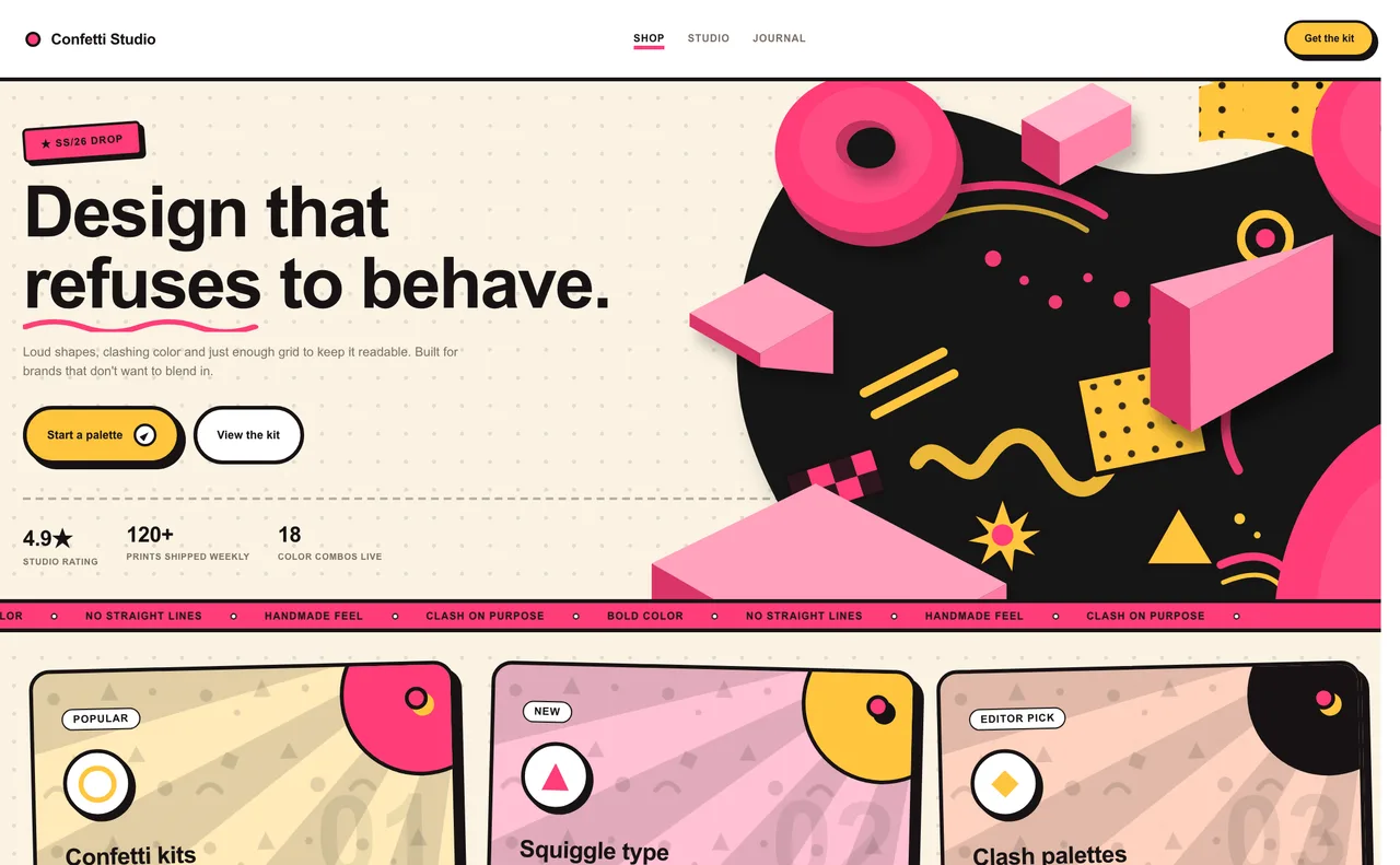
- Memphis - Milan's Memphis Group, 1981-1988. Clashing saturated colors on a cream background with thick black outlines. Suits playful brands, creative events and youth products.
Nostalgic, game and sci-fi aesthetics
Styles borrowed from video games, early-internet culture and science fiction. Color does most of the work here - neon on dark, chrome and gloss, or warm sunset tones.
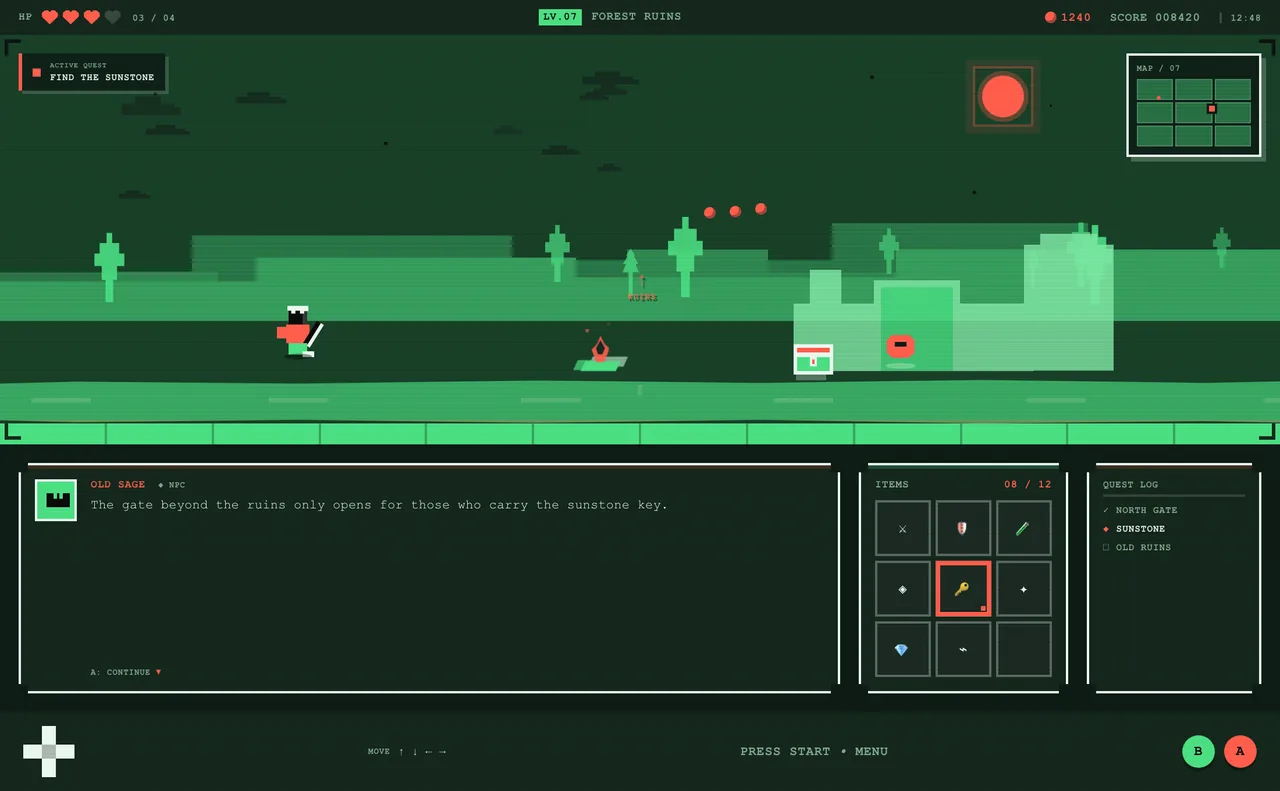
- Pixel Art - 8-bit and 16-bit games. A dark screen background and a small palette with one saturated primary and one high-contrast accent. Suits games, indie projects and nostalgic campaigns.
- Y2K - Late 1990s and early 2000s internet. Cool saturated blues and violets with one loud accent such as magenta or cyan. Suits music, fashion and retro-tech launches.
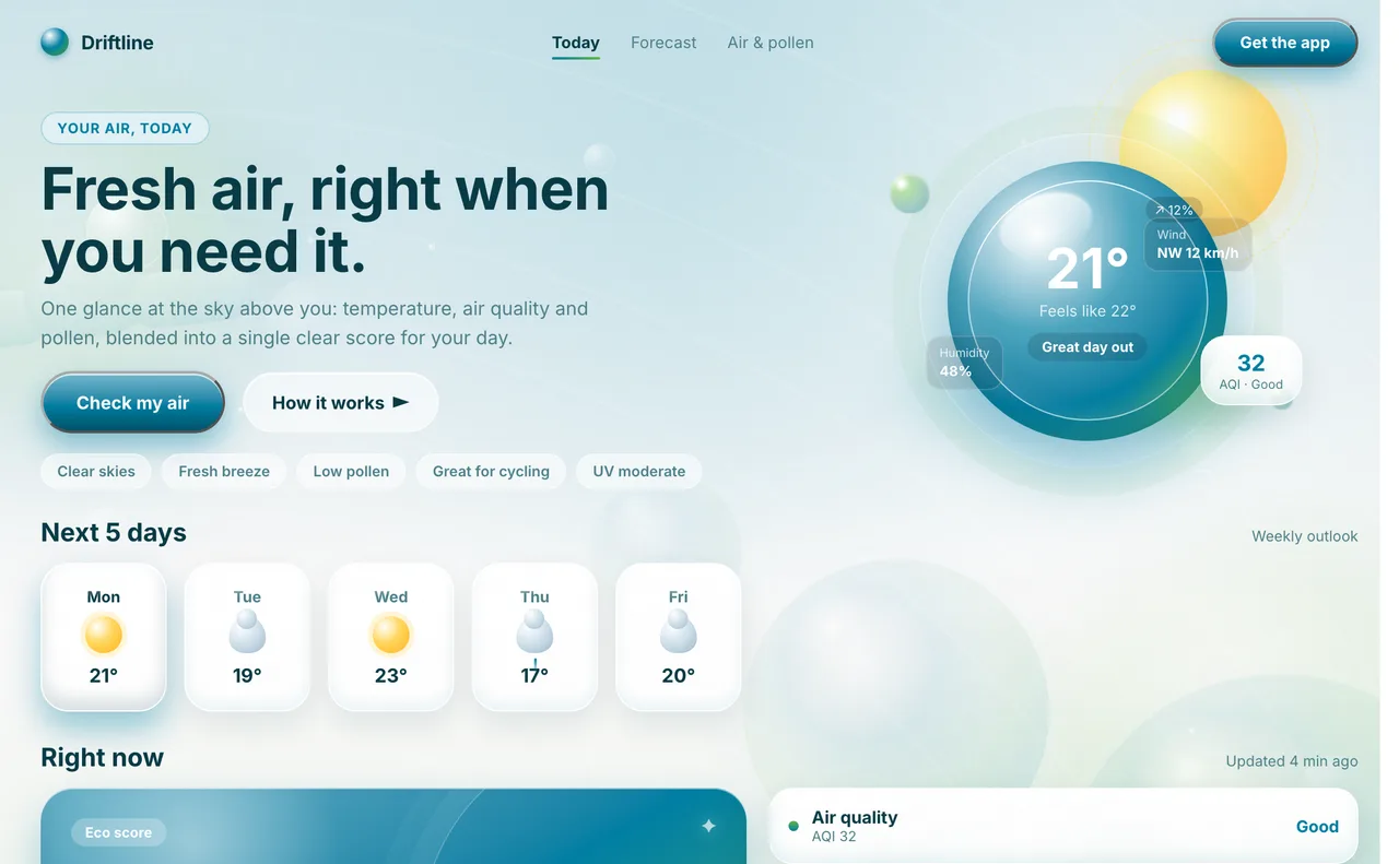
- Frutiger Aero - Mid-2000s tech optimism. A pale sky-blue base, an aqua primary with a leaf-green accent and deep teal text. Suits wellness, eco and friendly consumer apps.
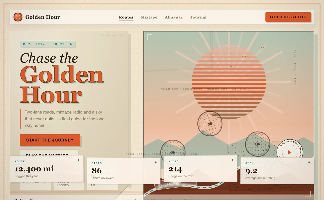
- Retro - 70s travel-poster graphics. A warm cream base, a burnt-orange primary with a teal accent and brown ink. Suits radio, food, travel and nostalgic brands.
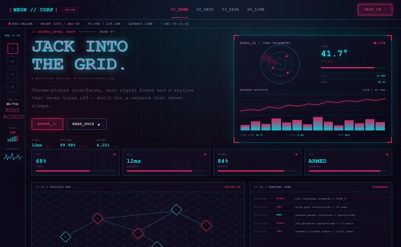
- Cyberpunk - Dystopian sci-fi HUDs. A near-black or deep-violet background with electric cyan and hot magenta neon. Suits gaming, crypto and nightlife.
Contemporary web design styles
Styles that emerged from the modern web itself - product landing pages, studio portfolios and dashboard marketing sites.
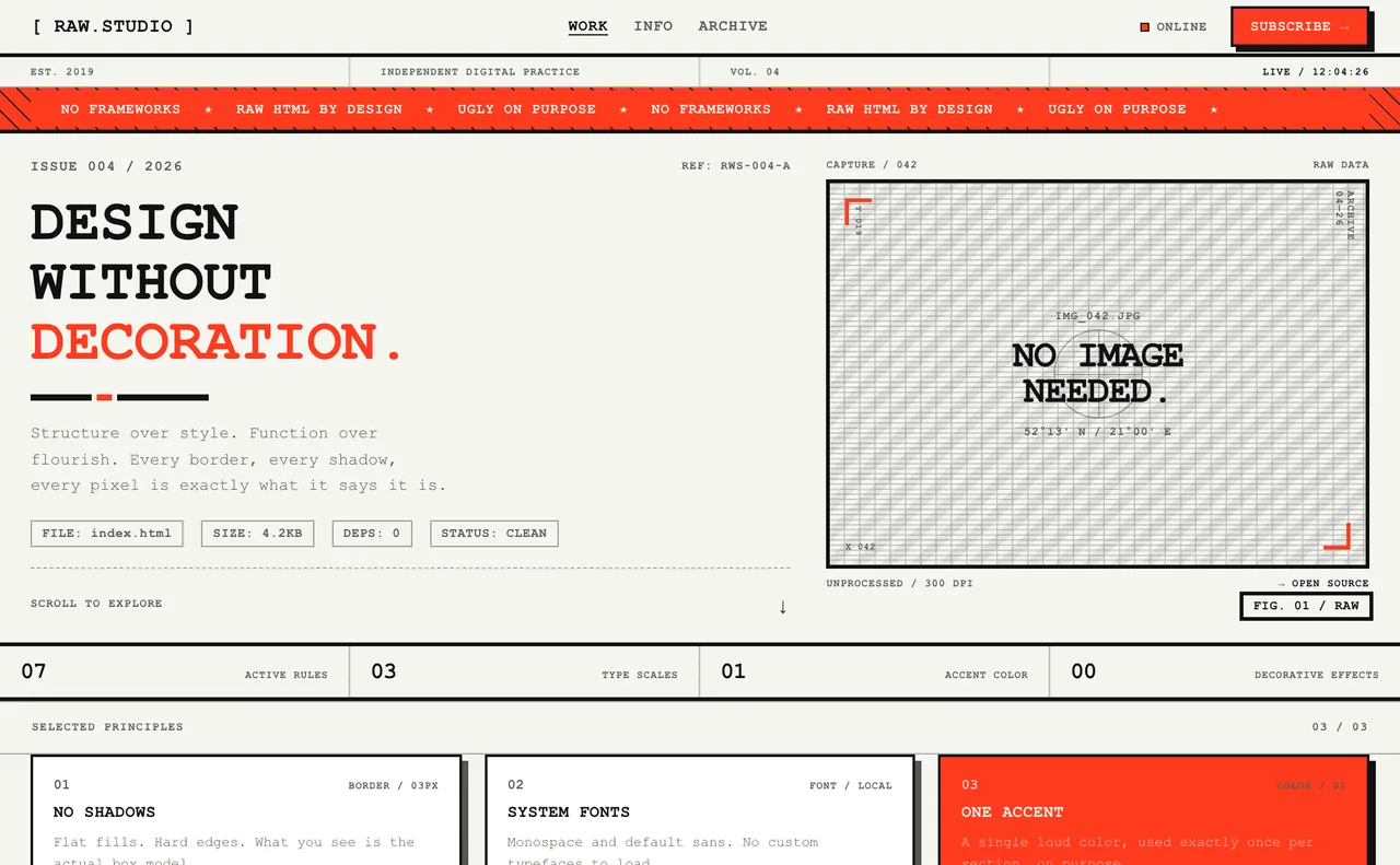
- Brutalism - Raw-HTML revival of the late 2010s. Stark near-black on white, thick borders, flat color and one loud accent. Suits creative studios, zines and anti-corporate statements.
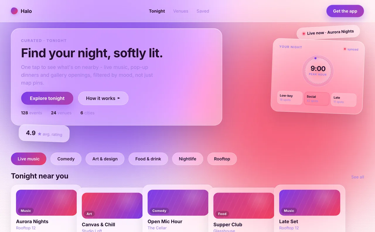
- Glassmorphism - Frosted glass panels over a vivid background. Mostly white panels with two-color gradients for accents. Suits product UI, dashboards and SaaS or fintech landing pages.
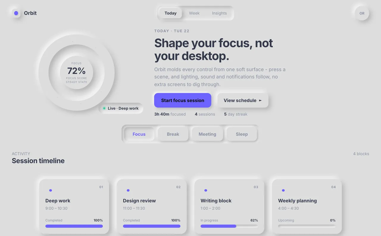
- Neumorphism - Soft UI, 2019-2020. One neutral base color for every surface, shaped by a light and a dark shadow, with a single accent for active states. Suits smart-home, wellness and music controls.
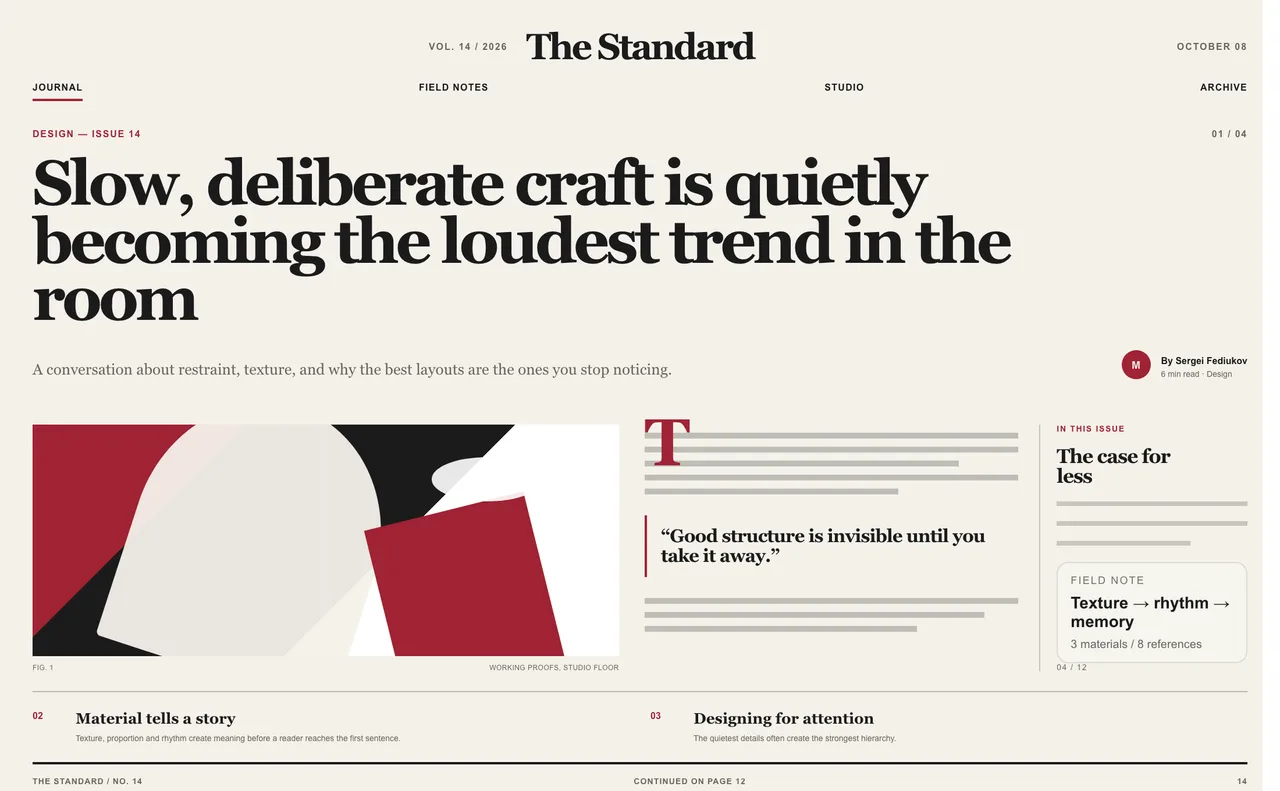
- Editorial - Print journalism layout. A warm paper-like background, near-black ink and one restrained accent. Suits magazines, blogs and content-led brands.
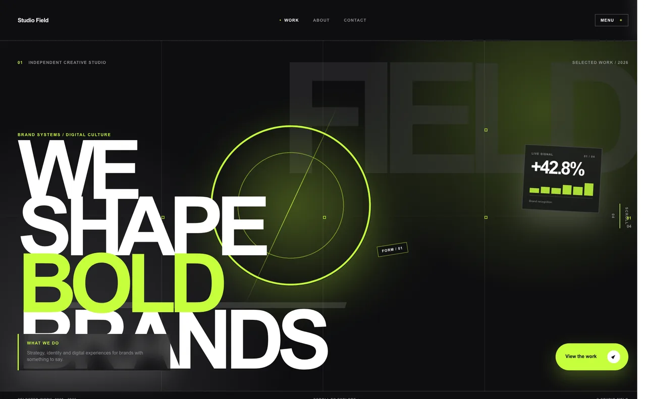
- Oversized Typography - A giant headline instead of a hero image. A near-black or near-white base with soft, low-opacity accent washes. Suits portfolios, studios and launch pages.
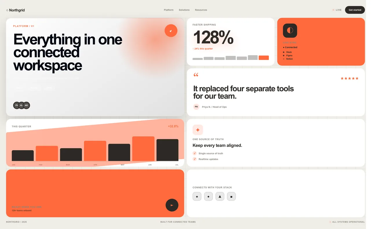
- Bento Box - A modular grid of unequal tiles. A muted background, mostly white tiles and one consistent accent. Suits SaaS feature pages and product overviews.
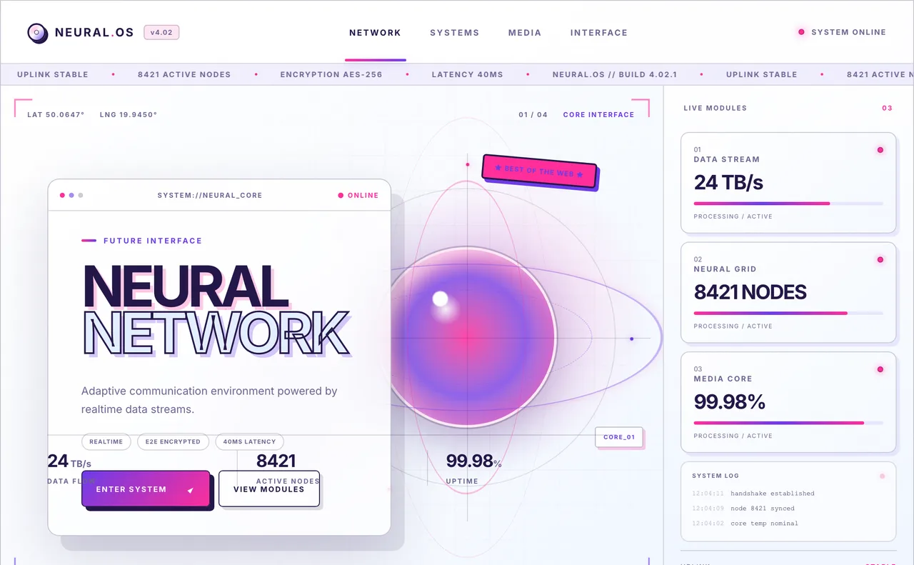
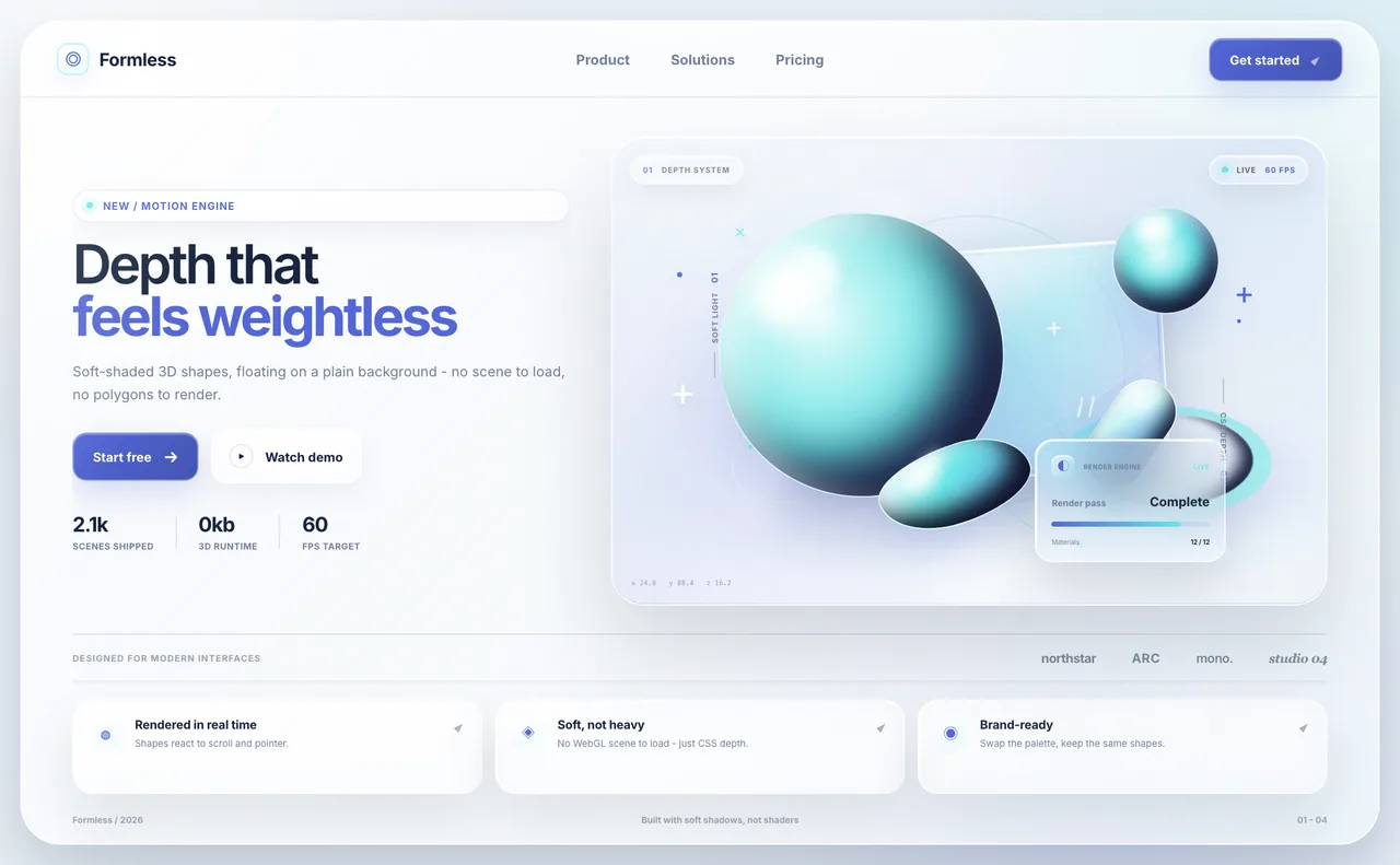
- Lightweight 3D - Soft-shaded spheres, blobs and rings built from gradients. A calm background with shapes in one or two brand colors. Suits SaaS and product landing pages.
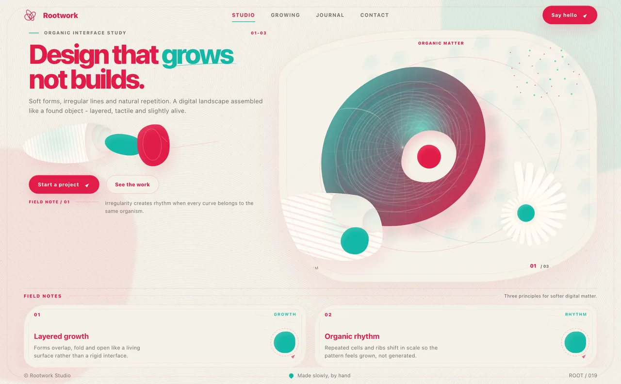
- Biomorphism - Organic blobs and wavy dividers. Earthy cream, clay and sage with one warm accent such as terracotta. Suits wellness, food and sustainability brands.
How to choose a web design style
Start from the project, not from the trend. A few questions narrow the list quickly:
- What is the content? Text-led sites suit Editorial or Swiss Style; product and feature sites suit Bento Box, Lightweight 3D or Glassmorphism.
- What should visitors feel? Trust and clarity point to Swiss Style or Bauhaus; energy and play point to Memphis, Y2K or Retro; luxury points to Art Deco.
- Who is the audience? Gamers and developers respond to Cyberpunk, Pixel Art and Futurism; wellness and lifestyle audiences respond to Biomorphism and Frutiger Aero.
- How much color do you have? A single strong brand color fits Swiss Style, Bauhaus and Brutalism; a wide saturated palette fits Memphis and Glassmorphism.
- Can you keep it readable? The more decorative the style, the more carefully you need to check text contrast and mobile layout.
Quick pick: which style for which goal
| Goal | Styles to look at | Why |
|---|---|---|
| Portfolio or studio site | Oversized Typography, Editorial, Swiss Style | Type and layout carry the first impression, so the palette can stay minimal. |
| SaaS or product landing page | Bento Box, Lightweight 3D, Glassmorphism | Modular, soft and dashboard-like styles show features clearly. |
| Blog, magazine or publication | Editorial, Swiss Style | Reading comfort comes first: paper tones, strong hierarchy, one accent. |
| Game, developer or tech product | Cyberpunk, Pixel Art, Futurism | Dark, HUD-like styles with bright accents match the audience. |
| Luxury or premium brand | Art Deco, Editorial | Formal, restrained palettes signal quality. |
| Playful or creative brand | Memphis, Retro, Frutiger Aero | Saturated, warm or glossy palettes create personality. |
| Bold, anti-corporate statement | Brutalism, Constructivism, Y2K | Stark contrast and flat color say the design is deliberate. |
| Wellness or natural brand | Biomorphism, Frutiger Aero | Soft, earthy or airy palettes feel calm and approachable. |
How style and color work together
A style is mostly a color decision in disguise. Glassmorphism fails on a gray background and Brutalism fails with a soft gradient; Swiss Style needs one accent used sparingly and Memphis needs several used loudly. The fastest way to see this is to try your own palette in a few templates and compare, which is exactly what the Explore Styles preview does.
Related: Explore Styles guide · How to test a palette on a real UI · All style pages
FAQ
What are the main web design styles?
Common web design styles include Bauhaus, Swiss Style, Art Deco, Constructivism, Memphis, Brutalism, Glassmorphism, Editorial, Bento Box, Cyberpunk, Y2K, Retro, Pixel Art, Frutiger Aero, Futurism, Biomorphism, Oversized Typography and Lightweight 3D.
Which web design style is best for a SaaS website?
Bento Box, Lightweight 3D and Glassmorphism are popular for SaaS landing pages because they present features in clear, modular blocks. The best choice depends on your brand colors and audience, so try your palette in each before deciding.
How do I pick colors for a web design style?
Each style has typical color traits: Swiss Style uses near-black on white with one bold accent, Cyberpunk uses neon on near-black, Retro uses warm cream with orange and teal. Preview your palette inside the style template to see whether it fits, then check text contrast.
Can I preview my own colors on these styles?
Yes. Every style has a live preview in Explore Styles where you can switch from the style's own palette to your current palette. Browsing is free; applying your colors to some templates requires Pro.
Are web design trends like Glassmorphism still used?
Yes. Glassmorphism is still common in product UI, especially dashboards and fintech, though it needs a vivid background and careful contrast to stay readable.
Want to see your colors in one of these styles? Preview your palette on these styles