Explore Styles: preview your color palette on web design style templates
The same palette can look elegant in one web design style and broken in another. Explore Styles renders your colors live inside 19 style templates - from Bauhaus and Swiss Style to Glassmorphism and Cyberpunk - so you can see how a palette behaves in a real layout before you commit to it, instead of judging a row of swatches.
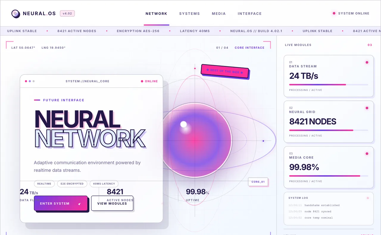
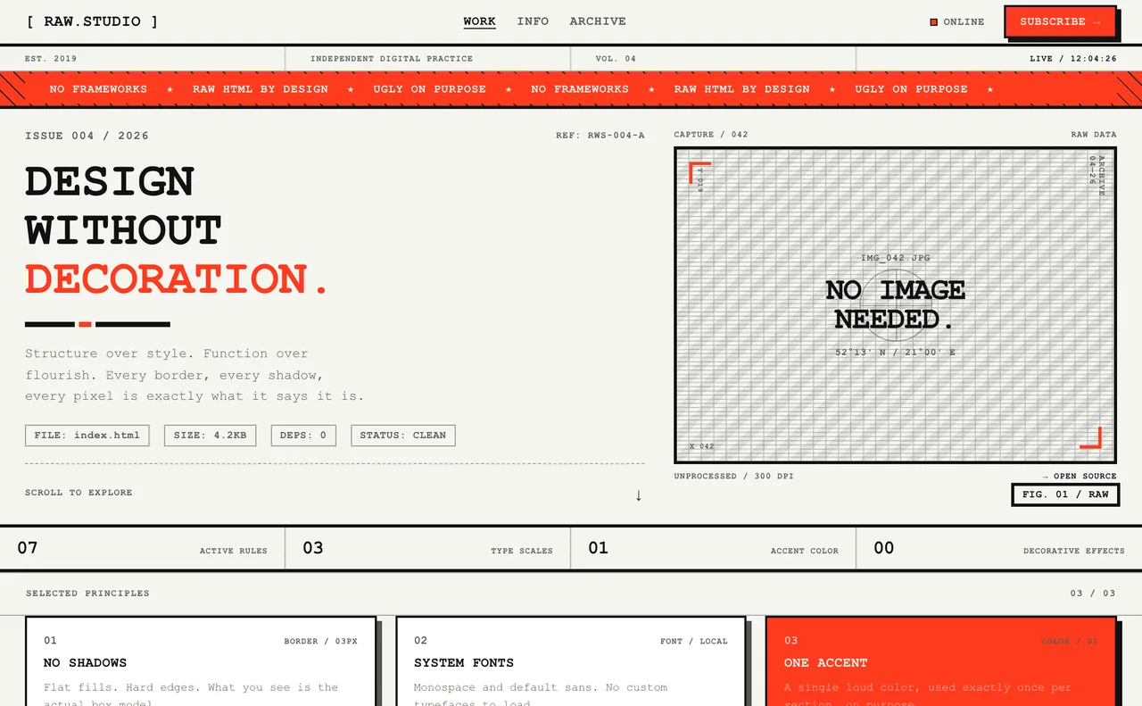
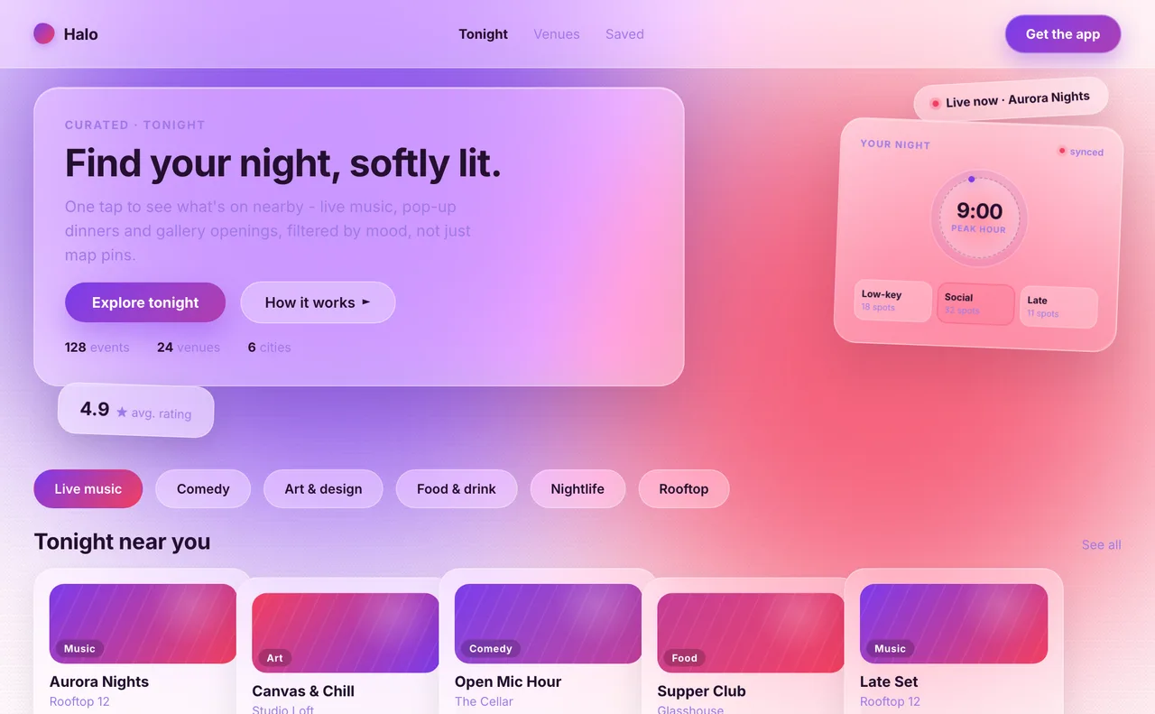
Three of the style templates, shown with their own default palettes. Click any of them to open the live preview and switch to your colors.
What is Explore Styles?
Explore Styles is the Styles mode of the Explore page. Each template is a full hero-level layout built in one web design style, with real typography, borders, shadows and accents, and it re-colors itself from your palette. That gives you three things swatches cannot:
- A style-aware read on color - Brutalism wants one loud accent on stark contrast, Glassmorphism needs vivid backgrounds, Editorial works on warm paper tones.
- A fast way to compare directions - switch between templates and see which style your palette naturally suits.
- A link you can share - send a teammate or client the exact template with the exact colors.
How to preview your palette on a style
- Build or generate a palette in the color panel - the primary and accent colors drive the templates.
- Open Explore and choose the Styles mode.
- Pick a template from the list. Every style is free to browse.
- Compare the two preview color sources (see below) to understand what the style looks like by default and how your colors change it.
- Use the expanded and mobile views to check the layout at the size your visitors will actually see it.
- Copy the share link, open the style page to read about the style, or apply the template's own palette to your color panel as a starting point.
Inspired palette vs Your palette
Every template can be viewed with two color sources:
- Inspired palette - the template's own signature colors, so you can see how the style is meant to look.
- Your palette - your current palette rendered inside the same layout, so you can see how your colors behave in that style.
Expanded view, mobile view and sharing
A style that looks great at desktop width can fall apart on a phone, and colors read differently at different sizes. The preview has controls for both.
- Expand the preview to see the template larger.
- Switch to the mobile frame to check narrow layouts.
- Use Share to copy a link to the current template and colors.
Styles you can preview
Each style has its own page with a definition, its typical color traits and a live preview:
Y2K · Editorial · Oversized Typography · Bento Box · Lightweight 3D · Brutalism · Bauhaus · Swiss Style · Art Deco · Cyberpunk · Biomorphism · Constructivism · Futurism · Retro · Glassmorphism · Pixel Art · Frutiger Aero · Memphis · Neumorphism
Not sure which style fits your project? Start with the visual guide to web design styles
Free browsing, Pro for applying your colors
Browsing every style template is free. Applying your own colors to some of the more elaborate templates is a Pro feature - those templates are marked, and you can always open them and look at their default palette first.
Tips for choosing a style for your palette
- Start with the Inspired palette to learn what the style is supposed to look like, then switch to Your palette - the gap between the two shows what your colors change.
- Vivid, saturated palettes suit styles built on color (Memphis, Y2K, Glassmorphism, Cyberpunk). Restrained palettes with one strong accent suit Swiss Style, Bauhaus and Brutalism.
- Dark, neon-driven styles need near-black backgrounds and very bright accents; a mid-tone palette tends to look muddy in them.
- Warm, low-contrast palettes fit Editorial, Retro and Biomorphism, but check body text contrast - soft palettes are where readability usually slips.
- Once you pick a direction, verify the details in the Elements preview and the contrast checker.
Related: Explore Products · How to test a palette on a real UI · Contrast checker
FAQ
What is Explore Styles in PaletteDesk?
Explore Styles is a mode of the Explore page that renders your color palette live inside web design style templates such as Bauhaus, Swiss Style, Brutalism, Glassmorphism and Cyberpunk, so you can see how the colors work in a real layout.
Can I preview my own colors on a web design style?
Yes. Switch the preview from the Inspired palette to Your palette and the template re-renders with your current colors. Applying your own colors to some templates requires Pro, while browsing every template is free.
How do I choose a web design style for my color palette?
Try your palette in several templates and compare. Saturated palettes tend to suit color-driven styles like Memphis or Glassmorphism, while a neutral base with one strong accent suits Swiss Style, Bauhaus or Brutalism. Always check text contrast afterwards.
Can I check the mobile version of a style template?
Yes. The preview has an expanded view and a mobile frame, so you can see how the layout and colors hold up at phone width.
Can I share a style preview with a client or teammate?
Yes. The Share button copies a link to the template you are viewing, including the colors, so the other person sees the same preview.
Ready to try your palette on a style? Open Explore Styles