How to test a color palette on a real website UI
A row of color swatches tells you whether colors look pleasant together. It does not tell you whether they work as a website. To find out, you need to see the palette on real buttons, text, cards and status states, in real layouts and at real screen sizes.
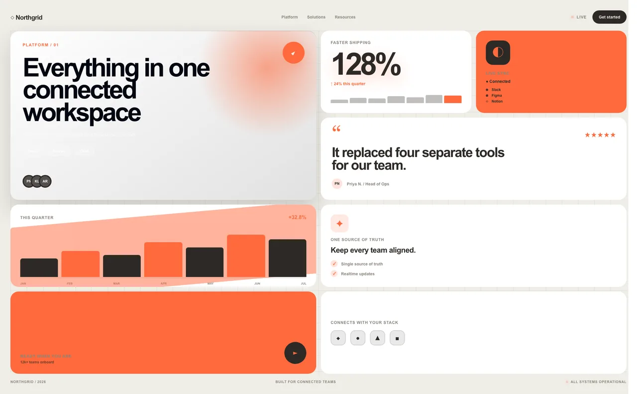
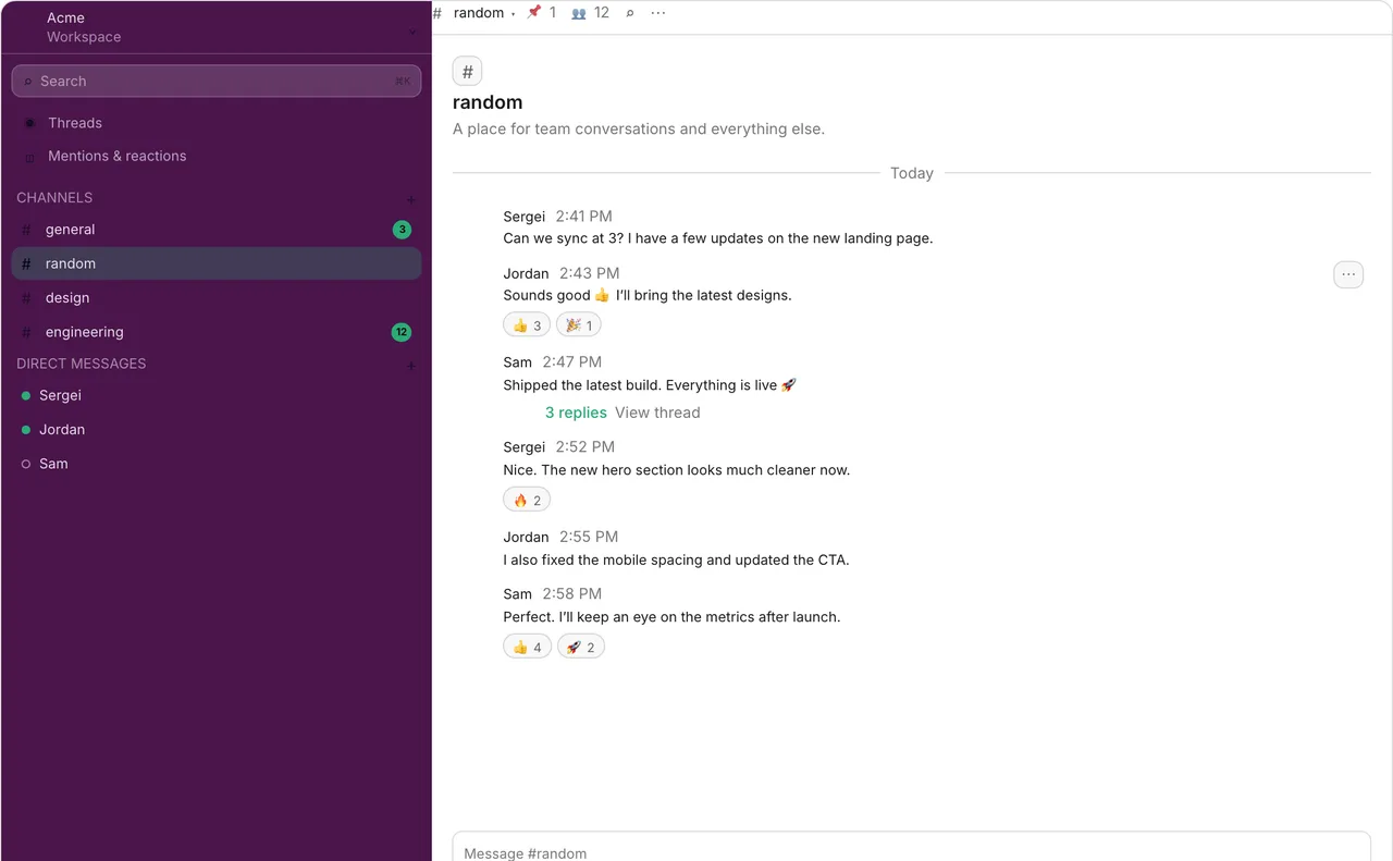
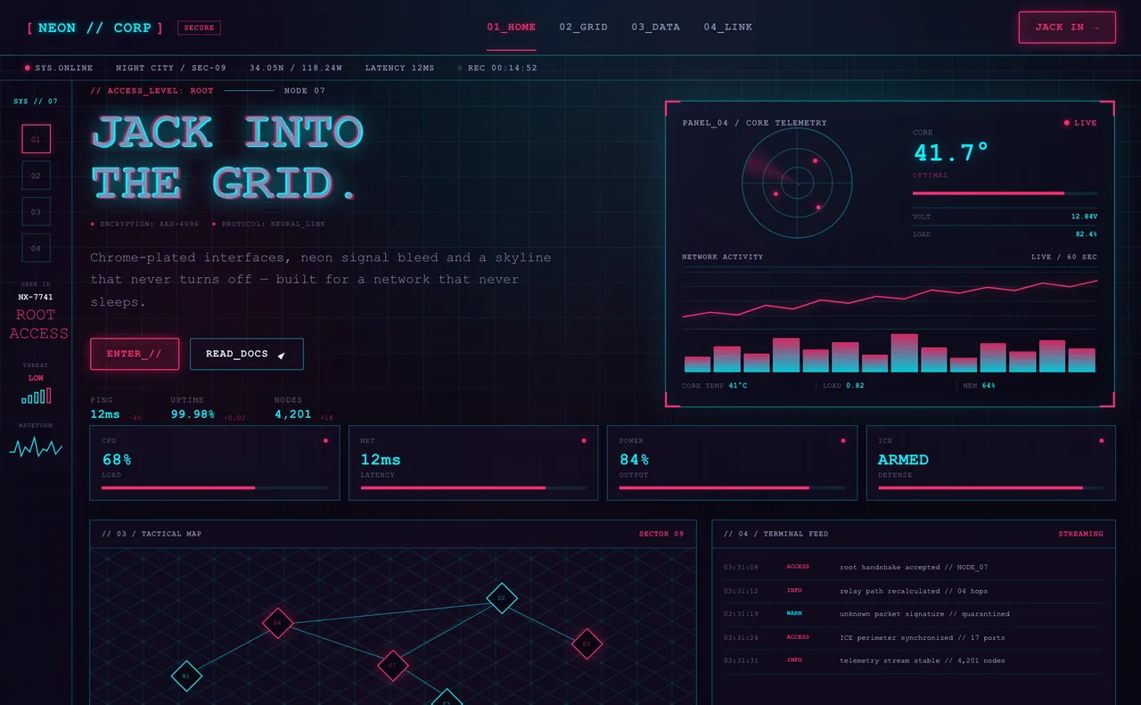
The same idea in three layouts: a modular Bento Box page, a team chat interface and a Cyberpunk HUD. Each is shown with its own default palette - in PaletteDesk you can switch any of them to your colors.
Why swatches are not enough
Swatches hide the problems that only appear in context:
- Contrast - a color that looks bold on its own can be unreadable as small text on a tinted surface.
- Proportion - a primary color that is lovely as a button can be overwhelming as a full-width banner.
- States - hover, focus, disabled, success and error all need distinguishable colors, and swatches show none of them.
- Themes - a palette that works on white can fall apart on a dark background.
- Screen size - hierarchy that is clear on desktop can collapse on a phone.
What to check
A short checklist covers most palette problems:
| Check | Why it matters | Where to do it |
|---|---|---|
| Text contrast | Body text and small UI text must stay readable against every background it appears on. | Elements preview and the contrast checker |
| Primary color in use | Buttons, links and highlights need to stand out without dominating the page. | Explore Products and Explore Styles |
| Status colors | Success, warning and error must be told apart from each other and from the primary. | Elements preview and dashboard templates |
| Light and dark surfaces | The same accent reads differently on white and near-black backgrounds. | Compare light and dark templates in Explore |
| Style fit | Some palettes suit a style naturally and fight another. | Explore Styles |
| Mobile layout | Narrow screens change proportions and make small text harder to read. | Mobile frame in the preview |
A simple workflow
- Generate or build a palette and settle on primary and accent colors.
- Preview it on the layout type closest to your project in Explore Products or Explore Styles.
- Open the Elements preview and fix any text or component contrast failures.
- Look at the palette in a second and third template - a palette that only works in one layout is fragile.
- Check the mobile frame.
- Share the preview link with your team or client for feedback, and export the palette when you are happy with it.
Explore Styles · Explore Products · Elements preview
Common mistakes
- Judging a palette only on a white background and never trying a dark surface.
- Using the primary color for everything, so nothing stands out.
- Testing only large headings and ignoring small text.
- Relying on color alone to signal status, without checking that the colors differ enough.
- Choosing a style for its look and only then discovering the palette does not fit it.
Related: Explore Styles · Explore Products · Elements preview · Contrast checker
FAQ
How do I test a color palette on a real website?
Render the palette on real layouts and components instead of swatches: check text contrast, the primary color on buttons and links, status colors, light and dark surfaces, and the mobile layout. PaletteDesk's Explore page does this with live style and product templates.
What should I check when testing a color palette?
Check text contrast, how the primary color looks in use, whether success, warning and error colors are distinguishable, how the palette behaves on light and dark backgrounds, and how the layout looks on mobile.
Why do colors look different in a real interface than in swatches?
In a real interface colors appear at different sizes, on different backgrounds and next to other colors. Small text, tinted surfaces and adjacent states expose contrast and proportion problems that swatches hide.
Can I preview my palette on more than one type of layout?
Yes. Explore Styles previews your colors on web design style templates and Explore Products previews them on app and dashboard layouts, so you can compare very different interfaces with the same palette.
Is there a free way to preview a color palette on a UI?
Yes. Browsing the style and product templates in PaletteDesk is free. Applying your own colors to some premium templates requires Pro.
Ready to see your palette in context? Explore Styles