Explore Products: test your color palette on real app and dashboard layouts
A palette that looks good as swatches can still fail inside a dense dashboard, a chat sidebar or a marketplace card. Explore Products renders your colors live inside 13 product layouts - developer dashboards, payments, team chat, travel marketplaces, video feeds and more - so you can judge a palette on the kind of interface you are actually building.
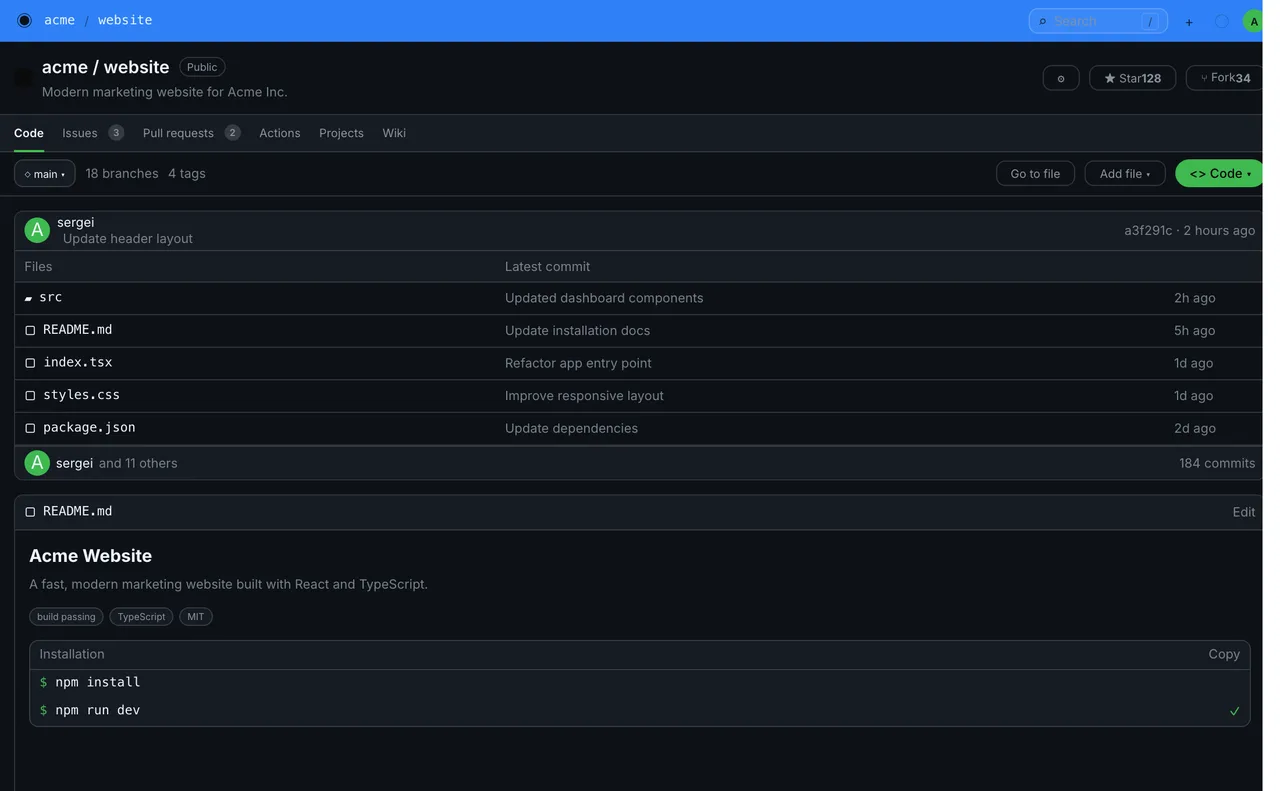
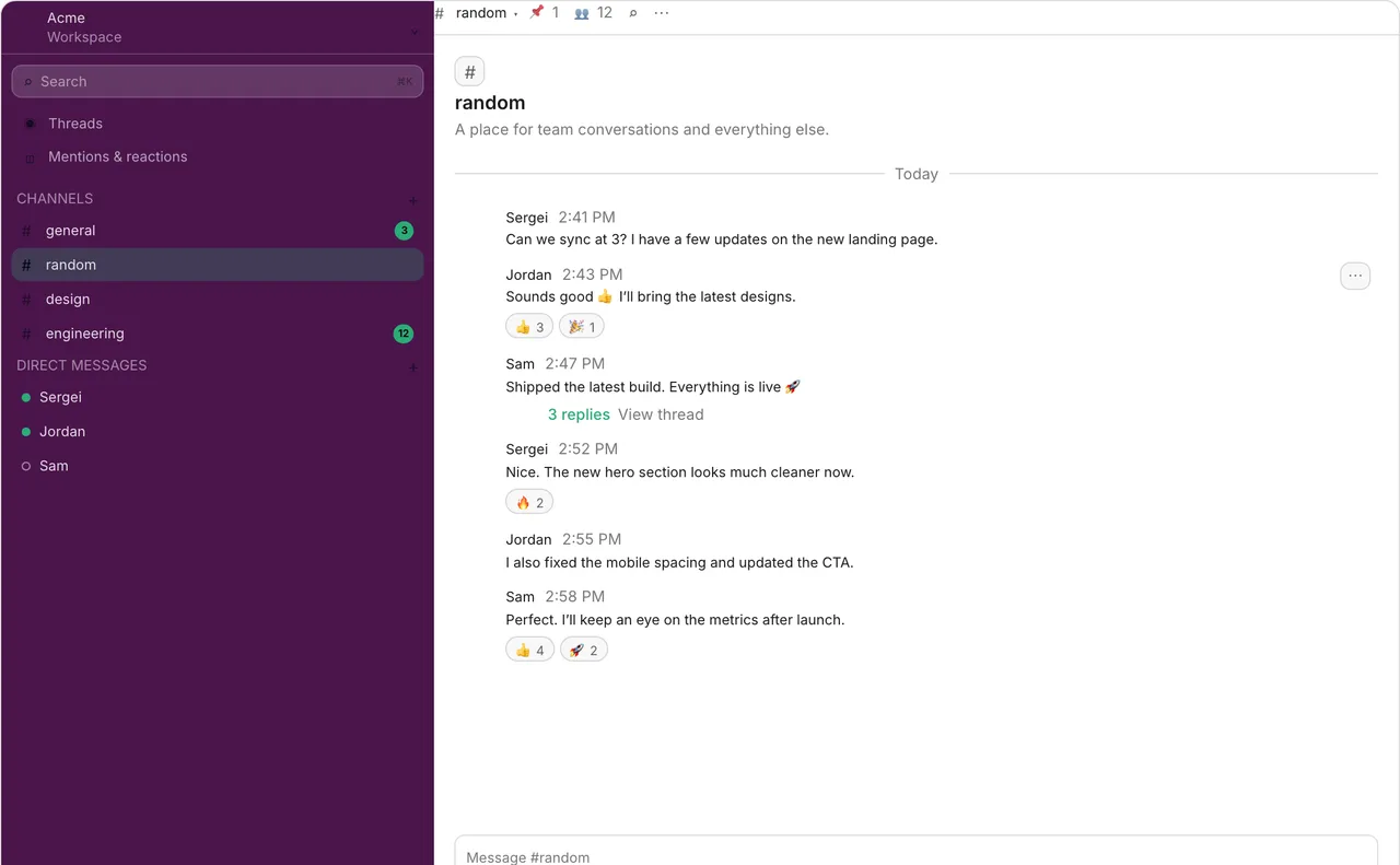
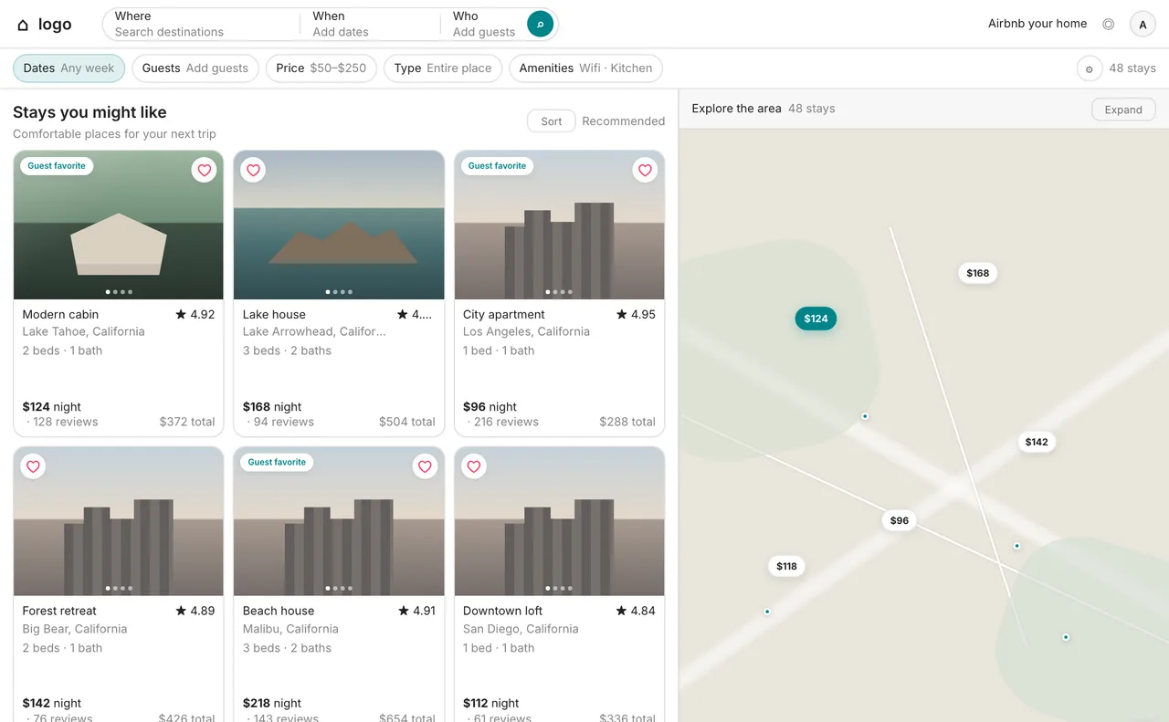
Three of the product templates with their default palettes. Click one to open the live preview and try your own colors.
What is Explore Products?
Explore Products is the Products mode of the Explore page. Each template is an original interface layout built in the spirit of a familiar product category, and it re-colors itself from your palette.
- You see your primary color on real buttons, links, sidebars and status badges, not on a flat rectangle.
- You compare very different interface types - dark and light, dense and airy - with the same palette.
- You get a template-specific palette as a starting point when you have no colors yet.
Why test a palette on a product layout?
Real interfaces stress a palette in ways swatches never do: small text on tinted surfaces, primary colors used at both button and link size, success, warning and error colors sitting next to each other, and dark surfaces that change how every accent reads. A layout shows those problems in seconds.
How to preview your palette on a product layout
- Create or generate a palette in the color panel.
- Open Explore and choose the Products mode.
- Pick the template closest to your product - a dashboard for an admin tool, a chat layout for a messaging app, a marketplace for a listing site.
- Switch between the Inspired palette and Your palette to see how your colors change the layout.
- Check the mobile frame and the expanded view.
- Share the link, or open the template page for a full description of its color system.
Product templates and what each one tests
Every template has its own page with a description and a live preview. Pick the one that stresses your palette in the way your product will.
| Template | Category | What it tests |
|---|---|---|
| Developer Dashboard | Developer platform - code hosting | Dark UI with dense text and success-green states |
| Project Management | Developer platform - project & issue tracking | A near-monochrome light UI where one primary carries all emphasis |
| Cloud Dashboard | Cloud platform - hosting & deployment | Pure black and white with a single accent - how far a palette can be reduced |
| Payments Dashboard | Payments infrastructure | Data-heavy fintech screens with navy text, a strong primary and a secondary accent |
| Document Editor | Productivity - notes & docs | Long-form reading and editing on a warm neutral background |
| Team Chat | Team chat & communication | A colored sidebar beside a white message area, plus online-status green |
| Community Platform | Community chat & voice | Dark chat with mention and alert reds next to the primary |
| Travel Marketplace | Marketplace - travel & stays | Photo-first cards where the primary must stay clear of the imagery |
| Food Ordering | Quick-service restaurant | Two loud brand colors and high-contrast text for quick scanning |
| Scheduling Platform | Scheduling & booking | Selected versus available states in a minimal light interface |
| Design Editor | Design tool - interface design canvas | A dark canvas with a selection primary and a warm secondary accent |
| Video Feed | Video platform - content feed | A neutral feed where one red primary and live indicators must stand out |
| Blog Platform | Publishing platform - articles & long-form writing | Text-first reading where links are the only accent |
The templates are original layouts inspired by product categories. Their colors are reference palettes, not copies of any company's official brand colors.
Inspired palette vs Your palette
Each template can be viewed with two color sources:
- Inspired palette - the template's own signature colors, to see how the layout is meant to look.
- Your palette - your current palette inside the same layout, to see how your colors behave.
What to look for
- Primary color on buttons and links - is it still clearly visible on both light and dark surfaces?
- Status colors - can success, warning and error be told apart at a glance, and from the primary?
- Small text on tinted backgrounds such as sidebars, badges and table rows.
- Borders and dividers - do they stay visible without becoming heavy?
- The mobile frame - does the layout keep its hierarchy at phone width?
Related: Explore Styles · Elements preview · How to test a palette on a real UI
FAQ
What is Explore Products in PaletteDesk?
Explore Products is a mode of the Explore page that renders your color palette live inside product interface layouts such as developer dashboards, payments dashboards, team chat, marketplaces and video feeds.
Are the product templates official brand designs?
No. They are original layouts inspired by familiar product categories, and their colors are reference palettes rather than copies of any company's official brand colors.
How do I test a dashboard color palette?
Open a dashboard-style template in Explore Products, switch to Your palette, and check primary color on buttons and links, status colors, small text on tinted surfaces and borders. Then verify contrast in the Elements preview.
Can I preview both light and dark interfaces?
Yes. The templates cover both light and dark interface types, so you can compare how the same palette behaves on each.
Is Explore Products free?
Browsing the templates is free. Applying your own colors to some premium templates requires Pro, and those templates are marked in the list.
Ready to try your palette on a product layout? Open Explore Products